
I went on a road trip with a friend recently, and even though I was “on vacation”, branding lessons kept jumping out at me. Here are the 3 most valuable lessons we learned about branding on our summer vacation:
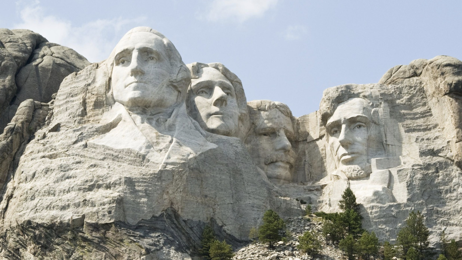
At Mount Rushmore, we overheard a little boy talking to his mom: “Those guys on the outside are on money. But who are the other two?”
Of course, he recognized Washington and Lincoln. Their faces are everywhere – and in his experience, they’re the ones on the money that he probably sees most often. More importantly, their faces are shown on the one- and five-dollar bills in a similar pose – so they’re recognizable.
Poor Jefferson and Roosevelt! He couldn’t recognize them because they appear most commonly in profile – on the nickel and dime. When he saw their full face, it didn’t look like the same guy. And, Jefferson does appear on the $2 bill – but that bill is pretty obscure. The kid hadn’t seen those often enough to be able to remember who Jefferson was.
The lesson here? Using a recognizable photo consistently in your brand makes you more memorable. And, being memorable is good for business! Make sure that you use your photo often in your brand, and that you choose a photo that looks like you do in real life!
2. Consistency and repetition stirs curiosity, creates familiarity, heightens suspense, strengthens hunger and desire and inspires loyalty.
And, this works even if the exact same thing isn’t repeated over and over again. For several hundred miles on Interstate 90, there are billboards making all sorts of claims, like:
- “Free Ice Water: Wall Drug”
- “Don’t Miss Out: Wall Drug”
- “Western Art Treasures: Wall Drug”
- “Dinosaurs! Wall Drug”
- “Homemade Donuts: Wall Drug”
I would say, “You get the picture”… but the truth is, you can’t. I could fill pages and pages with all of the messages from all of the billboards. There were literally hundreds of them, stretching over hundreds of miles. And every one repeated the simple phrase, “Wall Drug”.
This is what happened:
- After the first few billboards, we were curious. I got out my phone and Googled “Wall Drug” just to see what they were talking about.
- After a few more signs, we felt familiar with Wall Drug. After all, we’d seen about a dozen signs on top of Googling it. We were experts, and we liked feeling like we knew what the signs were all about.
- With every passing sign the suspense grew. We wondered… are we there yet? How much further?
- After a while, the signs awakened our hunger and desire (I’ll also admit that this was right around the time we started seeing the signs about the donuts). We found ourselves really wanting to go to Wall Drug.
- We went out of our way to go to Wall Drug. The signs had inspired our loyalty and we passed up opportunities to stop at more convenient places so that we could see what all the fuss was about!
Imagine if your brand could get all of those results from a bit of consistency and repetition! Best of all, consistency and repetition in your brand is easy – it just means that you have to use the same messages and designs that you’ve already created again and again. So there’s no new work for you.
3. Using whitespace makes you stand out, and makes your audience stop and really notice.
During our trip, the scenery was really quite green. Green corn. Green fields. Green forests.
Until we reached the Bonneville Salt Flats in Utah. Suddenly, there was a whole lot of white out the window!
That white made the salt flats one of the most remarkable and stunning places we saw on our trip.They really stood out because they were so different from the green, green, green we had been seeing for days.
It made us stop the car and spend some time there relaxing and looking at the scenery – instead of just whizzing by, we really paid attention. Wouldn’t you like your audience to stop and spend more time paying attention to and noticing you?
See how you can incorporate more white space in your brand so that you won’t look like everyone else, trying to cram everything onto a page. It will make your designs look different from everyone else’s and make your clients stop and really look at what you have to offer!


You knocked it out of the park on this one Erin. Great post! Love how you tied it to everyday like–or vacations in this case! My favorite posts are ones that come from everyday experiences. In fact, at the social media panel discussion we had last week, I advocated looking for topic inspiration in everday occurences–they’d be amazed at the connections they find. Plus they make for more interesting posts and also give insights into who you are. Thanks for providing such a great example of how to do that.
Hi Erin, Nice post! When reading your post I felt like I was on your trip with you. I love how you used great examples to bring the points home.
Thanks, Avery and Melody! 🙂
And, Robert – thanks for pointing out my mistake. There’s the inspiration for the next article – Brand Name Confusion. 🙂